Turning an idle ad screen into a customer first sales surface
Turning an idle counter screen into a calm, customer first ordering experience that lifts basket value through nudges people actually welcome.
- Origin
- Design initiated. Spotted, pitched, and carried to production.
- Role
- Design lead / manager. Originated the concept with the design HOD, set research and design strategy, mentored the product designer executing hands on, directed the pitch video, and oversaw production.
- Type
- B2B/B2C · Phygital ordering · Upsell & cross sell
- Projected impact
- +₹5 in dine in bill per order (projected)
- Status
- POC approved by the CEO. Built. Going to real user testing in stores.
A screen showing static ads
While rolling out the new Elate POS systems, the design team noticed something. The new hardware included a customer facing screen at the counter, and it was only showing static ads. That felt like a waste. Together with the design HOD, I pitched turning that passive advertising surface into an active sales touchpoint: a Customer Facing POS experience, CFPOS.
It wasn't a brief handed down to us. The opportunity came from design spotting an underused surface and making the case for what it could be.
There was a real business problem underneath it too. POS ordering gave customers little visibility into what they were being billed, and whether an upsell happened at all came down to whichever staff member remembered to offer one. That left money on the table. The goal became twofold: make the order visible so customers trust the bill, and make upselling consistent at scale without slowing down the queue.
Research: watching real counters
We ran participatory research. Staff interviews and customer observations across both peak and non peak hours, plus a look at customer facing ordering systems already in the market like Chaayos, Taco Bell, and McDonald's. Three things stood out at the counter.
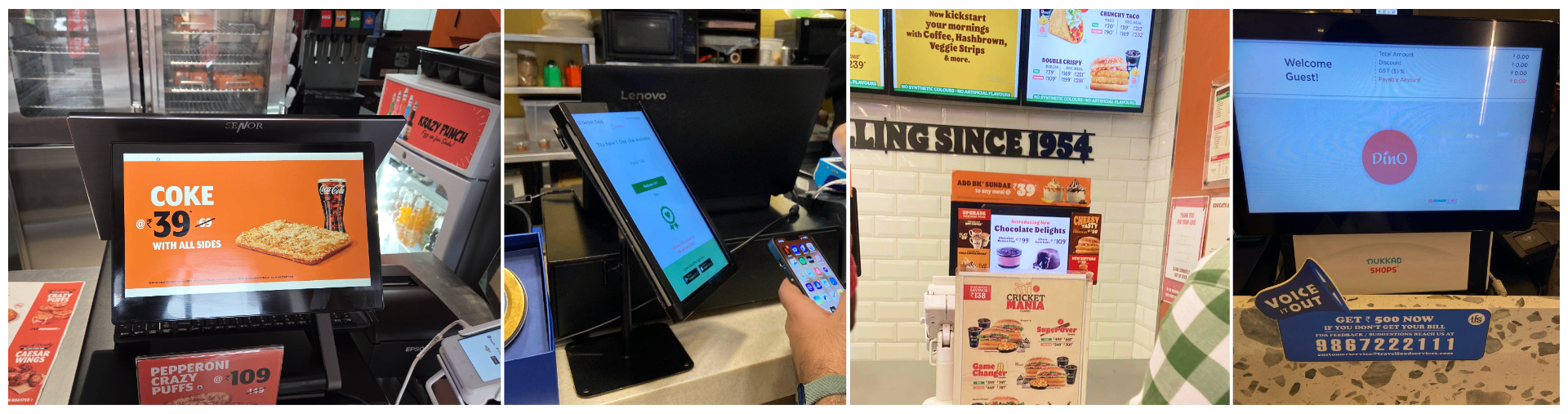
Staff selling is inconsistent. Under queue pressure at peak hours, staff prioritise speed, and selling opportunities quietly get missed.
Customers want guidance, not a kiosk. People trust the human at the counter to explain deals and customisations. At Chaayos, where the customer screens acted like self service kiosks, customers largely ignored them and leaned on the person instead. The screen mostly got used for repeat items.
Reconfirmation slows things down. Staff verbally repeat the order back to confirm it before placing, which adds delay at the counter.
Two more things shaped the layout. A phone number isn't a universal ask: tier 1 QSR regulars share one automatically, but newer users need a reason. And the bill is what customers keep glancing back at, so the added items list and running total became the anchor of the screen, with everything else arranged around it.
What the business needed from it
The screen had to earn its place commercially, not just look good. Four outcomes framed success: higher order value (grow business per order through add ons and combos), loyalty adoption (drive repeats by making earned benefits visible), first party customer data (to personalise and improve the experience), and tech leadership (reinforce JFL's positioning as a tech forward food brand). Holding these alongside the customer's experience is what kept the design honest. Every nudge had to serve both.
Read together, the research and those goals pointed at three opportunity areas: make selling standardised instead of staff dependent, give customers a guided flow rather than leaving them to trust memory, and confirm the order in real time so the verbal reconfirmation that slowed the counter wasn't needed.
Debating the direction
We weighed three directions for what the screen should fundamentally be.
Passive display only. The screen just mirrors the order. Low complexity and easy to ship, but limited impact on throughput or sales.
Fully interactive mini kiosk. The customer drives everything themselves. Maximum staff load reduction, but it asks customers to change how they order, and the research already showed they'd rather deal with the human.
Conversation catalyst. The screen supports the staff customer conversation instead of replacing it, prompting the right moments ("Make your Farmhouse cheesier?") and confirming the order visually. It reduces miscommunication and keeps people engaged, at the cost of occasionally slowing an order slightly.
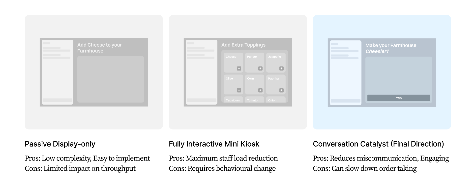
We chose the conversation catalyst. It fit what the research told us, that customers trust the human and want guidance, while still standardising the selling and confirming the order on screen. Minimal touch was part of it, just enough to move the customer from watching to participating, but the point wasn't touch for its own sake. It was to back up the conversation already happening at the counter. A hard constraint kept us honest throughout: it had to run on the existing POS and need no extra staff to operate.
The core decision: upsell that serves the customer, not just the business
The sharpest question was how to make the screen earn its keep without making checkout feel pushy, especially after the Chaayos lesson that people want a fast, human, low friction counter.
Our answer was to build every nudge around a customer benefit, so what helps basket value also helps the customer. Cheese burst crust is a good example. It's already popular, it makes the pizza more indulgent, and it lifts business per order at the same time. Two mechanics carried this.
Indulgence led (motion). If a pizza is already in the basket, a cheese dip shown in motion nudges a cheese burst upgrade. It plays to the customer's own appetite rather than to pressure.
Value led (savings). A combo upsell framed as a saving. It grows the basket by giving the customer something back, money off, instead of just asking them to spend more.
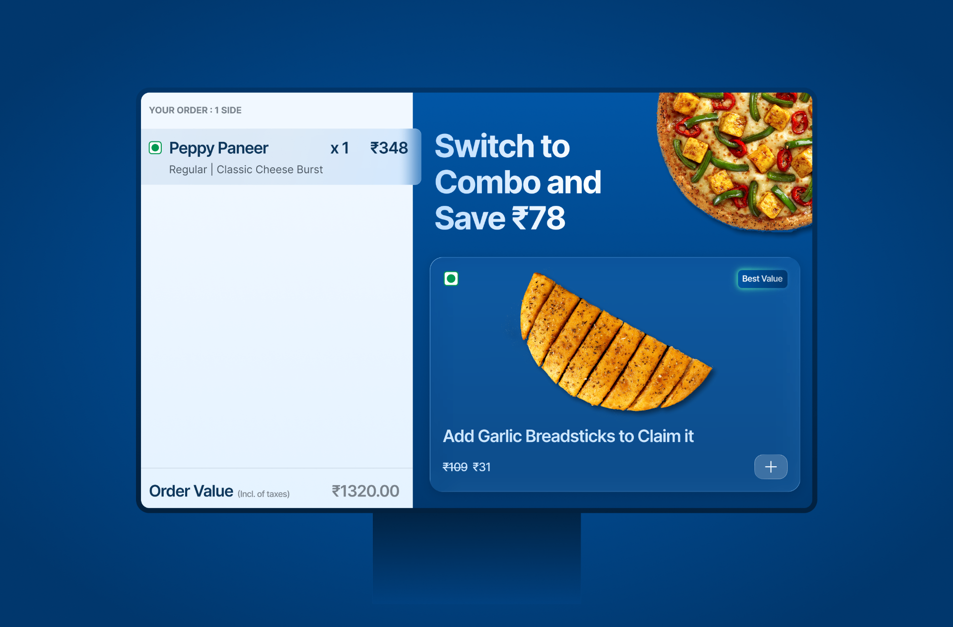
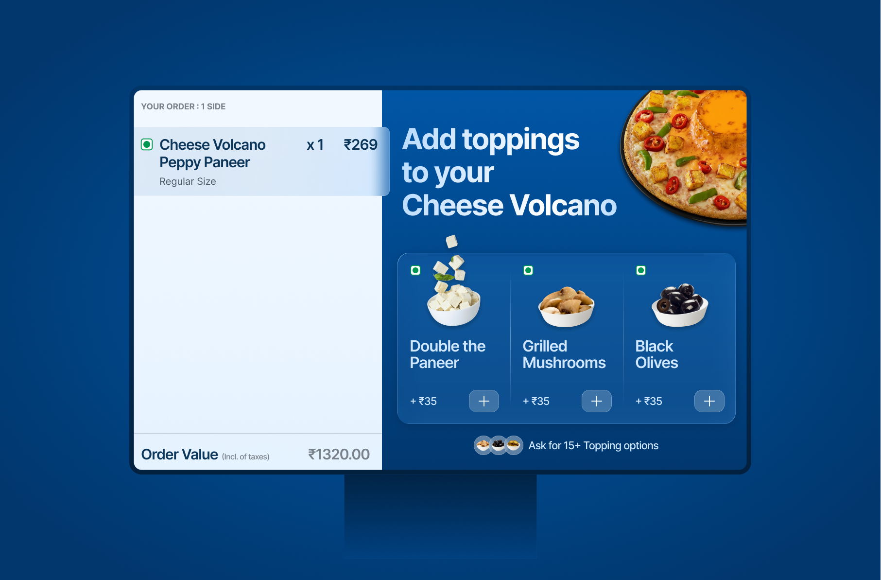
The screen also opened with the customer's favourites, items they'd ordered before in dine in or on the app, so it was useful and personal before any upsell showed up. If the screen earns relevance first, a nudge has the right to appear. This also opened up an omnichannel benefit: loyalty rewards and account perks that had been stuck in the app could now surface and be redeemed during dine in.
Designing for a noisy room, not an ideal user
A counter in a busy store is loud, distracting, and full of competing demands on a customer's attention. The design answered that head on. Large, expressive food imagery and a deliberately spare UI cut through the noise without piling on cognitive load, and subtle motion draws the eye instead of demanding it. Nudges appear at natural pauses, and the customer is free to act on them or ignore them, which keeps the order moving while still guiding it.
Keeping the two screens in sync
Staff and customer look at opposite screens, so the two have to stay in lockstep or the counter breaks down. We mapped each state of the staff POS to a matching CFPOS state, and added clear callouts so staff always know what the customer is seeing. When a customer is mid customisation, for instance, the staff screen shows a "User is customising" flag, so nobody talks over a choice in progress. Getting this mapping right was quietly one of the harder parts. It's the difference between a companion screen and two screens fighting each other.
Deliberate restraint: phase one over gold plating
We could have gone hyper personalised from day one. Tech bandwidth for the first phase was limited, so we chose not to. Phase one did the core well. Favourites, the benefit led nudges, a spare and direct layout, and left deeper personalisation for later. Scoping to what could actually ship well, instead of designing everything we could imagine, was a conscious call.
The clearest thing phase two unlocks is bringing the customer's own benefits into the store. Loyalty rewards, offers, and account perks that today live only in the app could become visible and redeemable during a dine in order, so value a customer has already earned follows them to the counter instead of sitting on their phone. That shifts the screen from a generic upsell surface to a personal one, and makes the experience feel consistent whether you order on the app or in store. It's held back only by current tech limits, not because it's minor. In many ways it's where CFPOS gets most interesting.
From POC to production
We built a POC first, a short video of an order taker and a customer using the concept, and pitched it to the CEO. It caught on across the organisation and got accepted as a project. From there it became a design led build going into production, which I oversaw end to end: roadmap, timeline, and design decisions. It has since been built and is heading into real user testing in stores.
What I'd carry forward
What stays with me is that the best upsell doesn't feel like one. A counter screen sitting next to a human can't behave like a kiosk demanding attention. It has to earn each glance. Anchoring on what the customer already cares about, the bill and their favourites, and framing every nudge as something they gain, is what let the screen lift basket value without costing the calm, fast checkout people actually come in for.