Elate POS Ecosystem
Reimagining a legacy point-of-sale system to cut new-staff training from six weeks to under an hour.
- Year
- 2023
- Role
- Design lead
- Type
- B2B · Systems design
The system, and why it was hard
The organisation had decided to migrate the complete POS ecosystem from local servers to a fully cloud-based architecture, which unlocked real-time operational data across the network and let the engineering team build what they described as India's first Android-based POS. That migration was the opening to rethink the experience itself, not just port the old one forward.
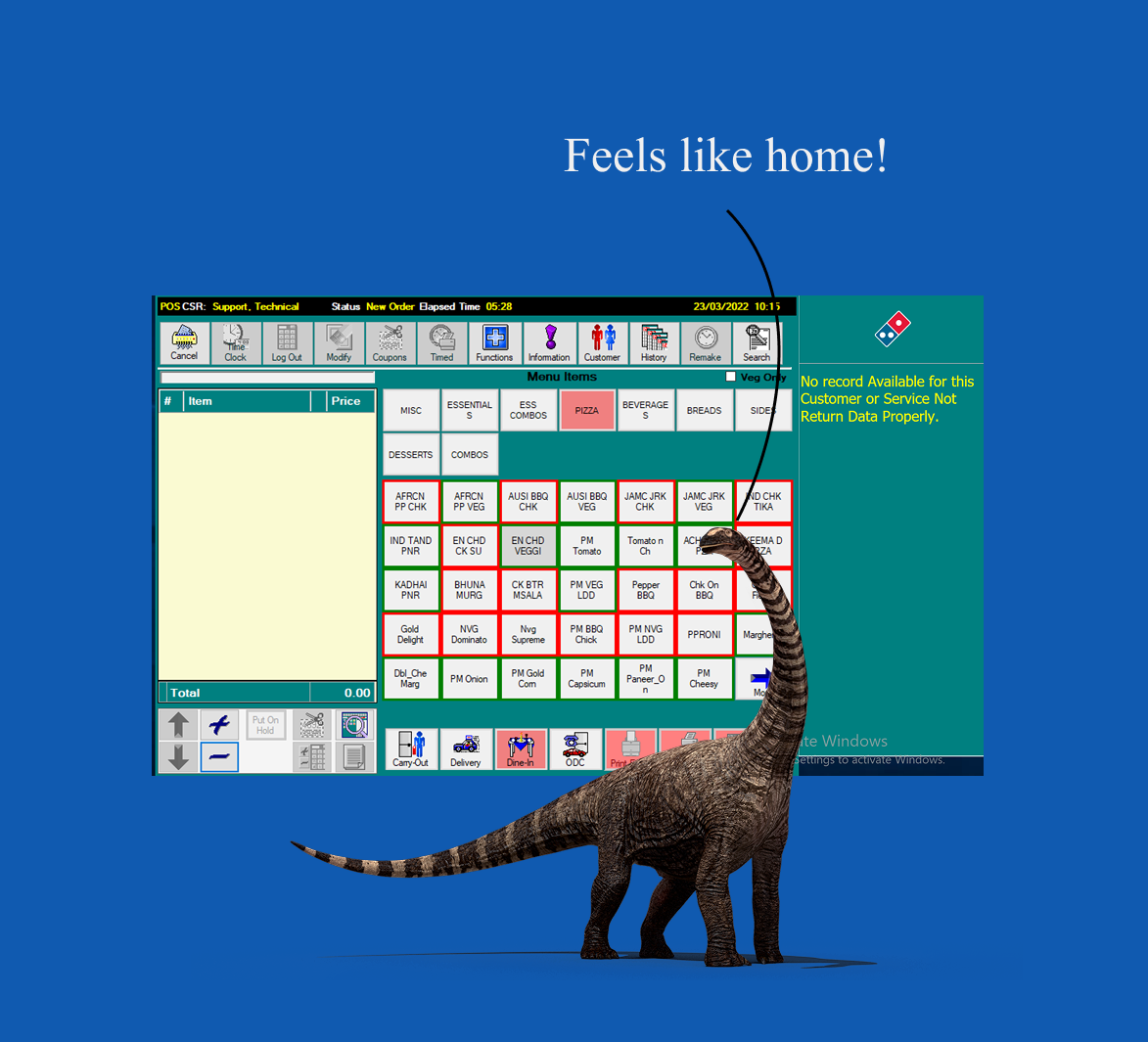
Domino's stores ran on a legacy point-of-sale system built on local in-store servers, with an interface that hadn't meaningfully changed in years, closer to a Windows 98 utility than a modern product. It worked, but it carried two costs that compounded at scale: it relied on coded product nomenclature that staff had to memorize, and it was unfamiliar enough that getting a new recruit fully productive took roughly six weeks.
In a business with high staff turnover and hundreds of stores, six weeks of training per recruit is not a usability footnote. It's a structural drag on the entire operation.
What I led
I led the design of the new POS end-to-end. I set the foundation of the visual and interaction design, mentored the second designer who then helped scale the system across screens, and worked alongside our researcher to run the field study that everything else was built on. Throughout, I stayed hands-on in the core flows while bringing structure to how the small team worked.
Research: finding the real training-time drivers
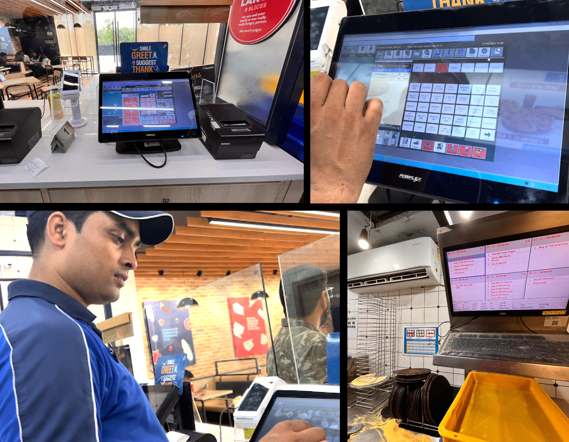
We started on the ground. The three of us shadowed order-takers across multiple stores, through full lunch rushes, watching real shifts rather than relying on stated workflows. On-ground research was done to understand three things at once: the interactions and the environment they happened in, the conversation between the order-taker and the customer, and the order-taker's simultaneous interaction with the POS. The goal was to find what actually made the old system hard to learn, not what we assumed made it hard.
Three drivers surfaced:
Coded nomenclature. Staff had to translate product codes in their heads, which is exactly the kind of memorization that stretches training out.
Unfamiliarity. The interface didn't resemble any product staff already knew, so every recruit started from zero.
A misleading assumption about images. Competitor systems leaned on product photos. The obvious move was to copy them, but watching staff told us otherwise.
The three drivers explained the training-time problem. But because we documented the full flow rather than sampling isolated screens, a second, broader issue surfaced: the system fought the way orders actually happen at the counter. We traced every interaction an order-taker makes end-to-end, from session login through customer entry, item punching, order confirmation, payment, and the order-ready SMS. Watching the real sequence, the same four problems repeated across stores.
Sequence mismatch. The system forced a User ID, then a mandatory customer name and number, before the menu, but customers start listing items the moment they arrive. Order-takers punched junk values to skip ahead and collected real details at the end.
Input and payment friction. Typing took two steps: select the field, then summon a separate keyboard. Card payment was worse. Staff manually transcribed a Plutus ID into the card machine on every transaction, and errors were common.
No system feedback. The POS was slow with no loading cues; staff relied on muscle memory to know a screen was coming. Order-ready alerts lived in a separate window, forcing constant toggling to fire each SMS by hand.
Flat hierarchy and poor legibility. Rarely-used actions carried the same weight as core ones. Low-contrast text, a reflective screen, and an interface filling only a fraction of the display all worked against someone moving fast in a live store.
None of this was solvable with a relabel. Seeing the full rhythm of an order, and where the system broke step with it, is what gave us the conviction to rebuild around how the work actually happens, not just to modernize the screens.
The decisions, and the reasoning behind them
Who this was for. Behind the six week number was a new recruit, usually 19 to 25, averagely tech-savvy in the way most people are. They know their way around a phone, WhatsApp, Instagram, Facebook, but not specialised equipment. Picture one on week one, working a lunch rush with no muscle memory and a system that spoke in codes he hadn’t memorised. Every second spent translating a code, hunting for a field, or waiting on a screen with no loading cue is a second the queue notices. This recruit is who the training time problem belongs to, and who every decision below was built to serve.
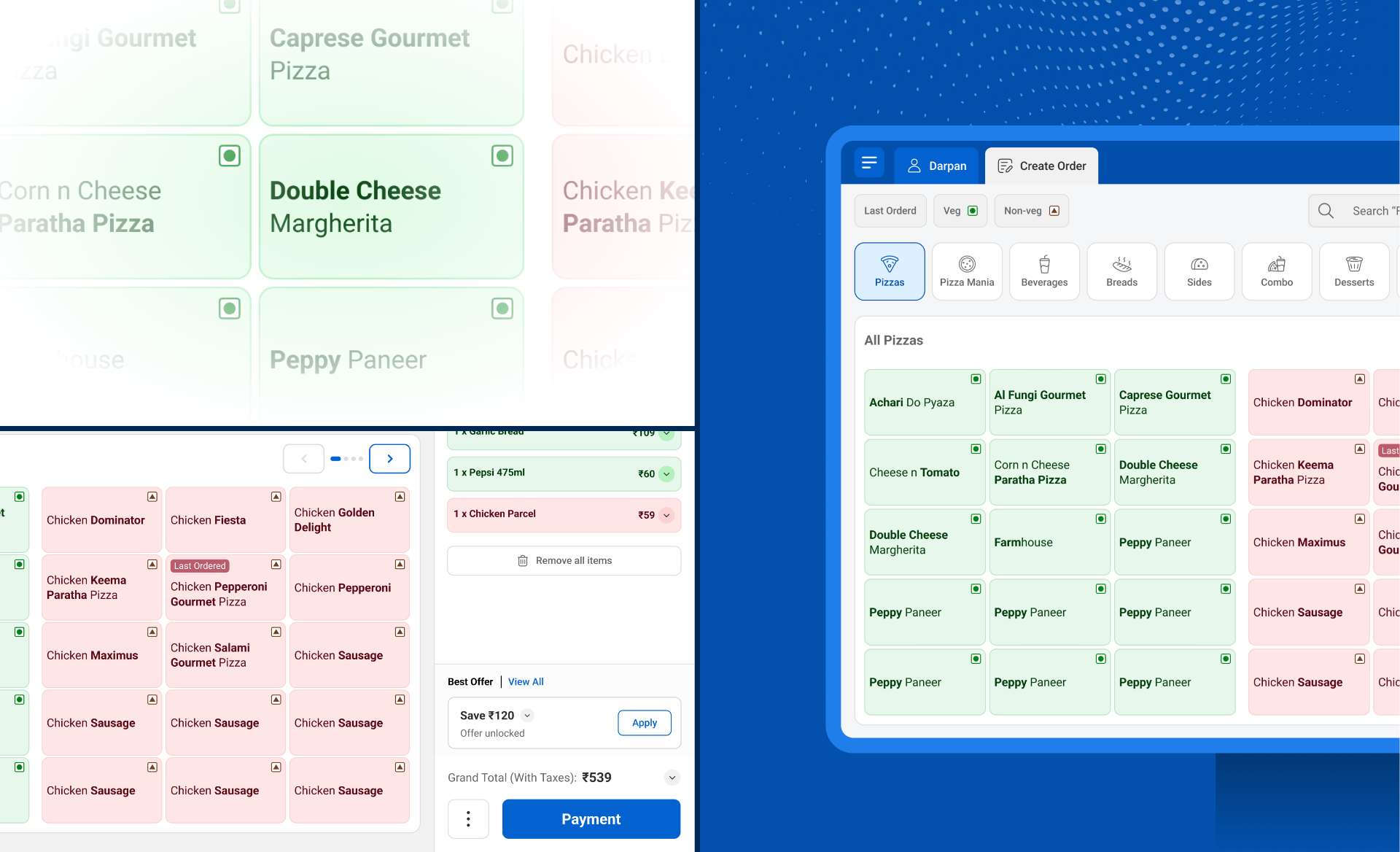
A conversational flow, because the counter is a conversation. Watching the exchange between order-taker and customer, the ordering wasn't a form being filled. It was a dialogue. A customer names a pizza; the order-taker asks "cheese burst or normal?", then size, then whether to change any toppings, each question surfacing only once the last was answered. We built the order flow to follow that rhythm: selecting a pizza opens crust, then size, then modifiers, in sequence, rather than presenting one dense screen of every option at once. The interface steps through the order the way the two people at the counter already do. Several other flows were shaped the same way. The structure came from watching the conversation, not from a screen-design convention.
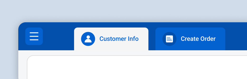
Two tabs, so the order-taker can follow the customer's lead. The natural thing customers do is start calling out their items the moment they reach the counter. The old POS cut across that: the order-taker had to interrupt and ask for a phone number before anything could be entered. We split the screen into two tabs, User Info and Order. If the order-taker wants to punch the order first and take the number afterwards, they can. The system no longer forces the conversation to start with a phone number it doesn't need yet.
Full product names instead of codes, a deliberate tradeoff. We replaced coded nomenclature with full, human-readable product names. This came with a real cost: typing or scanning a longer name can slightly increase order-entry time. We took that tradeoff knowingly, because full names removed a major source of order errors and were a primary lever on training time. Slightly slower, meaningfully more accurate, and dramatically faster to learn: the right trade for this business.
Removing product images entirely, the call that needed the most conviction. The instinct, reinforced by competitors, was to add photos. Our field observation pointed the other way. For many food products, a photo is a fast, reliable cue; a dosa and chole bhature read instantly and differently at a glance. Pizza doesn't behave that way. A Chicken Dominator and a 5 Feast Chicken Pizza share the same basic form, so a photo adds visual load without adding recognition. We removed images entirely and let clear names do the work. This was the decision that most separated research-led judgment from default best practice.
Bionic reading to protect scan speed. Going to full names raised a legitimate concern: longer text is slower to scan under time pressure. We introduced bionic reading in the product cards, bolding the leading part of each word so the eye locks onto the distinguishing term fast (Five Feast Chicken Pizza, Chicken Dominator). It recovered the scan speed that full names risked costing us.
An everyday product, not rocket science. The old POS felt like specialized equipment you had to be trained into. The design philosophy for the new one was the opposite: make it feel like an ordinary, familiar product, the kind of simple, recognizable interface people already use without instruction. Tab-based navigation and a deliberately familiar UI came directly from that principle, and from what we'd seen reduce friction on the floor.
The systems tradeoff: real-time vs. reliability
Moving to the cloud delivered real-time operational data, which matters enormously for a Domino's store handling customer complaints, inventory leaks, and wastage as they happen, rather than in next-day batches. But a POS that depends on a live connection is a liability the moment the internet drops mid-service.
We worked with engineering so the system ran in a full offline mode, capturing transactions locally and resyncing automatically when the connection returned. Stores got real-time visibility without betting service continuity on their network.
One ecosystem, not one screen
The POS terminal was the center of gravity, but the work extended across the operational chain, with the same design language carried into the surfaces on either side of the order.
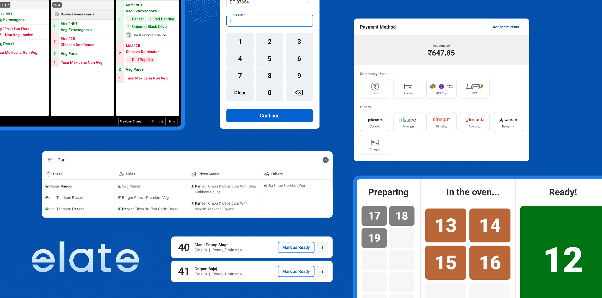
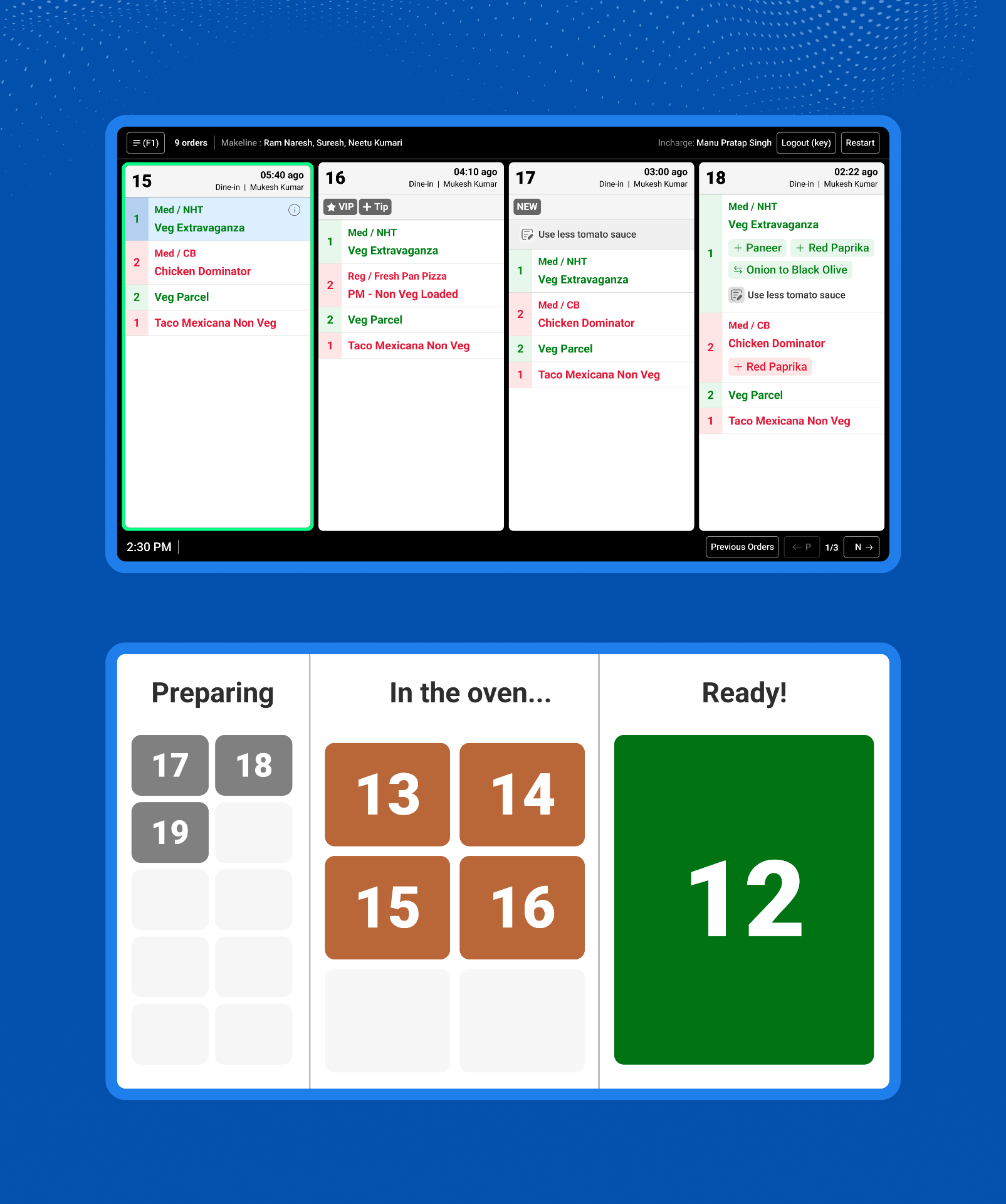
Kitchen Display System. The redesigned KDS brought order context to the kitchen through clear tagging. VIP orders, and delivery-guarantee timers (20-minute, 30-minute) surfaced directly on each ticket so staff could read priority at a glance and sequence work accordingly.
Customer-facing order number display. This was the most radical rethink of the three. Instead of the conventional scrolling list of order numbers, we used a responsive block layout that scales to fill the screen: one ready order takes the entire space, two split it evenly, three into three, and so on. The single goal was distance legibility. A customer should be able to read their status from across the room rather than walking to the counter only to find their order isn't ready yet. Form followed a very specific behavior we'd watched cause friction.
Together, the three surfaces made Elate a coherent system across staff, kitchen, and customer, not a single screen with a fresh coat of paint.
Outcome
New-staff training time dropped from roughly six weeks to under an hour. That was the metric the design work was ultimately accountable for, and a real, measured result. Beyond the number, the system replaced a piece of specialized legacy equipment with something a new recruit could pick up almost immediately, which changes the operational math of opening and staffing stores.
Elate is live in 240 Domino's stores across India today, and scaling to the rest of the network.
What I'd carry forward
Elate reinforced how I think complex operational systems should be built. Not by modernising screens, but by understanding the work first: the environment, the people, and the conversation the software is really part of. The strongest decisions on this project, from the stepwise ordering to removing product images, came from watching the floor, not from best practice or what competitors had shipped. In a domain this operational, the finished-looking answer is often the wrong one, and the right one only becomes obvious once you've seen how the work actually happens.
The other thing I carry forward is the scale of the stakes. A single interface decision, multiplied across hundreds of stores and a high-turnover workforce, stops being a usability detail and becomes an operational lever. Designing for that means holding the small interaction and the system-wide consequence in view at the same time, which is the balance this kind of work demands.