Designing the next generation Domino's app
I helped establish the visual language and design system for Domino’s India’s next generation app, and redesigned its core home experience to put food at the centre of ordering. The redesign contributed to a reported 65 basis point improvement in conversion. Since then, the product has continued to evolve, bringing new challenges in how customers navigate an expanding menu.
- Role
- Set the visual design language, design system, and food first philosophy; redesigned the core home experience; have overseen every change since; now redesigning home again for the curation era.
- Type
- Consumer mobile app · high scale B2C · design system · multi year product evolution
- Span
- 2022 foundation → present next gen redesign
- Through line
- The visual language and philosophy have been mine throughout; the philosophy evolved from food first to food first plus curation.
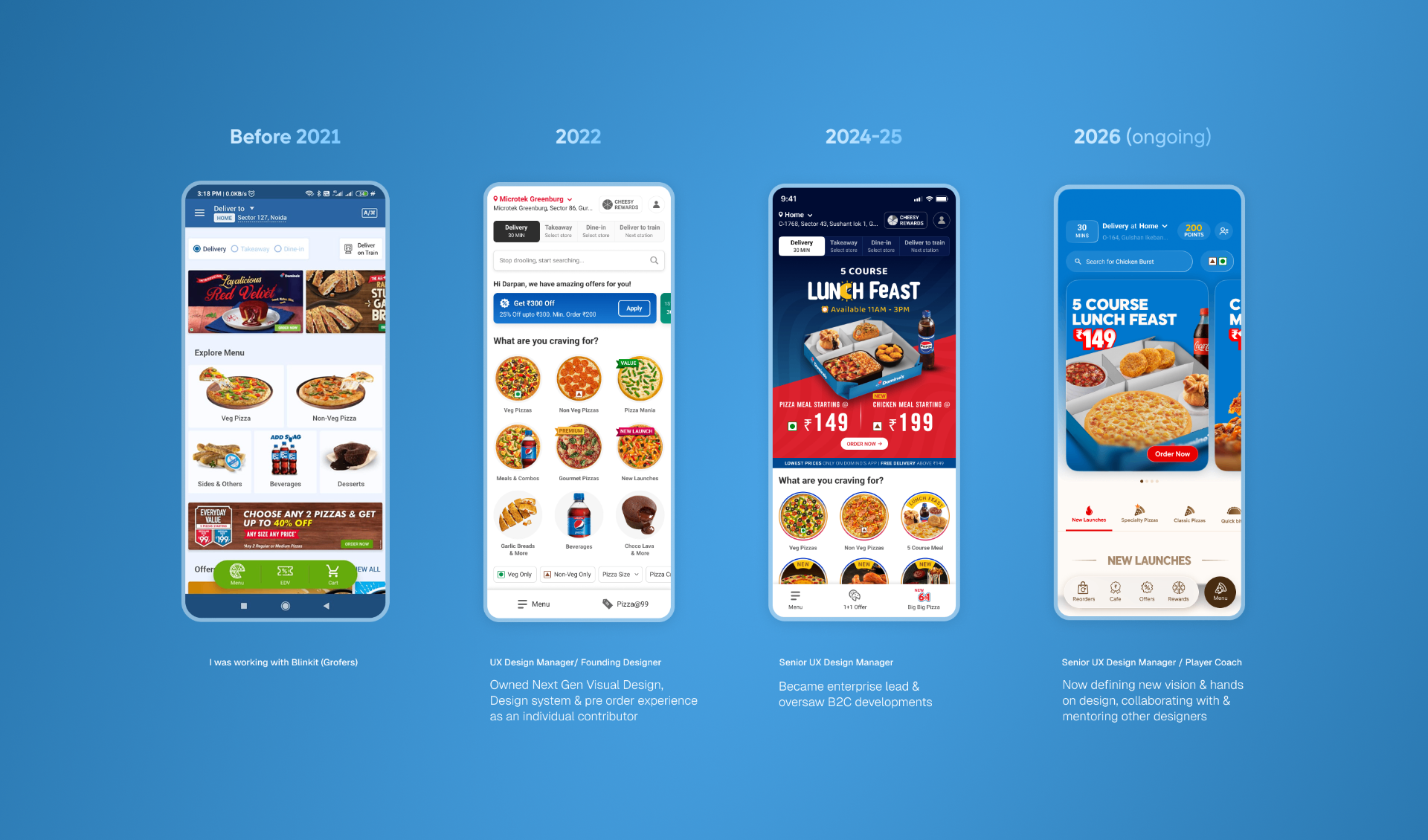
The opening, and the opportunity
In 2022 we set out to revamp the app, weighted heavily toward the visual experience. The goal was conversion. Post Covid, online pizza delivery had exploded, and there was a clear opening: move customers off third party aggregators and onto our own app, where we keep the margins the aggregators otherwise take. A better converting app wasn't cosmetic. It was a direct lever on the economics of the business.
The foundation
This is the era I set the foundation for. The piece that was mine to own was the design system, the visual aesthetics, and the philosophy, the language the whole app would be built in. From there we redesigned the core home experience for different kinds of users. They came with the same intent, to buy food, but through different lenses: order repeaters who want their usual fast, deal chasers who lead with offers, first timers who need orientation. Home had to serve all of them without feeling like three different apps.
Two things defined the foundation:
- A food first approach. We pushed visual quality up and brought the food forward, shot and framed to trigger craving, made the most prominent thing on screen. (Pulling the UI back so the food could breathe wasn't the goal yet. That came later. Here the intent was simply food, upfront.)
- Restraint on the menu navigation. The team kept the tab based nav from the previous generation. It worked fine for the assortment we had, and reinventing it would have spent risk and goodwill for no real gain. Knowing what not to redesign was as much the work as the redesign.
The design system was also the standard the rest of the team built against. The designers who went on to design the address and cart experiences worked within the same language, which kept a growing surface feeling like one coherent product.
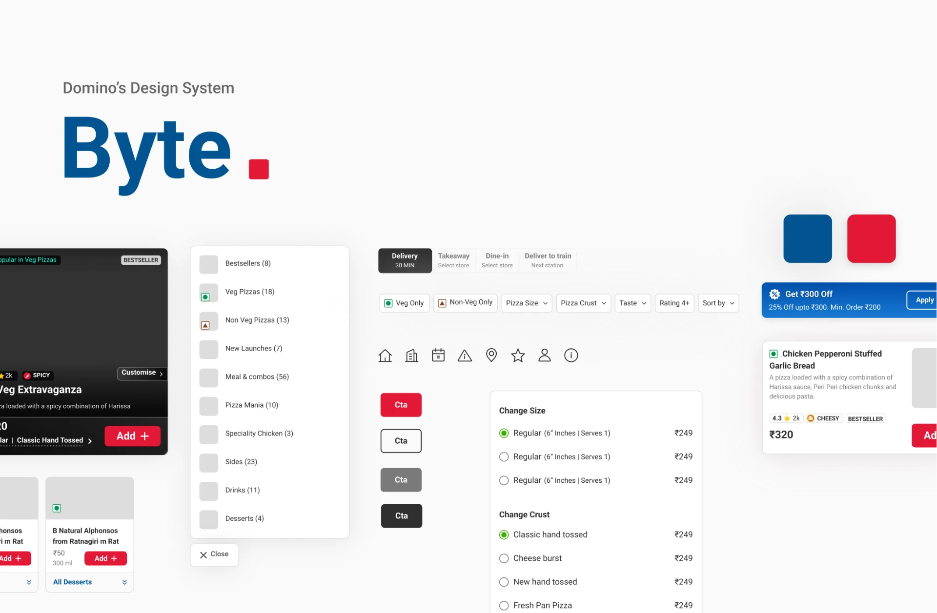
The result, and the years since
From that foundation onward, conversion climbed, and the app has matured release over release in the years since. I've stayed close to it throughout, overseeing the work and holding the visual language steady as the team and the surface grew.
The business impacts of the next-gen home & menu experience revamp
- Highly personalised home: Tailored user experience based on individual preferences for increased engagement.
- Different homes for different times and campaigns: Customisable home page to stay relevant during various occasions and campaigns.
- Smart Home | Top 10 & Food carousels: Improved user navigation and decision-making, leading to increased sales.
The visual language, and the noise it grew into
The food first philosophy had a concrete visual expression in 2022: images needed to be big and indulgent. So we designed larger product cards, introduced video cards, and gave marketing guidelines for the imagery to drop in. It worked at first, but carried a flaw that only showed up over time. Because the images were produced and uploaded by marketing rather than owned by design, the treatment drifted, and a single image style was never going to hold.
Part of what we realised as the assortment grew is that every product has a different USP. Some dishes need the topping in focus, some need the crust, some need the fill or the melt. One fixed image style can't sell all of them. So the catalogue filled with a mix of zoomed in and zoomed out shots at different intensities, backgrounds of varying weight, no two products framed the same way. Each image made sense on its own; together they piled up into visual noise, a feed of food that no longer felt clean or premium, the opposite of the indulgence the system was built for.
The fix is to own the image standard, not just advise on it: hard guidelines on angle, lighting, and treatment rather than recommendations marketing could interpret loosely. In the version being designed now the principles are sharper, no heavy backgrounds, the item kept in front and clear, low graphics, more food, and the card itself does more work. It went from being essentially a product photo to communicating the experience of the dish, which matters more as the menu fills with unfamiliar items a card has to explain, not just picture. With far more products on screen the app actually feels less noisy, because each one is treated consistently, and the UI finally steps back so the food has room to breathe.
More items on screen, less visual noise, because indulgence comes from the food being clear, not from graphics around it.

The drift, and the fix: images that diverged because every product had a different USP, versus one owned standard where the card sells the dish and the food stays the hero.
Why the philosophy had to evolve
The next shift wasn't a design whim. It came from the business. Domino's leaned into experimenting with dishes, using existing ingredients to create many new products. It worked: customers rewarded the innovation, sales rose, and the menu kept expanding.
The consequence was an assortment explosion. The menu went from around 80 items to roughly 150 in two years, and not just more pizzas and sides but genuinely more kinds of products. The very thing driving sales had quietly broken the way people navigate the app.
The tab based menu, carried over in 2022, worked precisely because the assortment was limited: a customer could flick from pizzas to sides to beverages in a tap. At 150+ items spanning far more variety, that same structure stops being fast and becomes a wall. The decision that was right for the old menu is wrong for the new one. So the philosophy moves: from food first to food first plus curation.
The next generation: from listing to curation
A tab based menu is fundamentally a listing: it presents everything and asks you to find your way. At small scale that's fine; at large scale it pushes the work of narrowing onto the customer. Curation flips that, the app understands how people decide and drills them toward a dish rather than laying the whole catalogue out flat.
So we researched how people actually pick a dish. It isn't by product category, it's by flavour, occasion, and similar parameters. People don't think "I want something from the sides tab"; they think "something spicy," or "something for a group," or "something new to try."
That research becomes the structure for the home redesign now underway. We've built multi level categories that let a customer drill from a top level intent down to a specific dish through the parameters they actually use: flavour, ingredients, experimentation, local flavours. The IA now mirrors how people decide, instead of how the kitchen organises its output.
A listing organises food the way the kitchen makes it. Curation organises it the way a customer decides.
Food first remains the bedrock: the craving, the visual quality, the product as hero. Curation is the layer that lets food first survive a menu three times the size it used to be.
What carries forward
The throughline is that a design decision is only ever right for a context, and contexts move. The same pattern showed up twice: the tab nav was right in 2022 and wrong by 2024, and the big image system held up until loose ownership let it drift into noise. Nothing about the design itself changed; the world around it did, the menu and the image pipeline scaling past what the original call assumed. The work that lasts isn't getting a decision right once. It's keeping a philosophy steady, food first, throughout, while staying honest about when the structure expressing it has been outgrown, and rebuilding before the cracks reach the customer.