Earning trust in fresh produce
An R&D pod formed during the COVID delivery boom to answer a simple question. Why don't people buy fresh produce online, and what would it take for them to trust us with it?
- Role
- UX Designer
- Team
- 2 PMs, 2 engineers, 1 analyst
- Timeline
- 2020, COVID lockdowns
- Company
- Grofers (now Blinkit)
- Type
- Consumer · Fresh grocery · R&D pod
- Outcome
- ~2x add rate from real stock photos; sourcing rhythm carried into Blinkit.
Context
When lockdowns hit, home delivery of groceries went from convenience to necessity, and demand for speed peaked overnight. In that moment, Grofers had one persistent weakness. Fruits and vegetables. F&V had always been a small share of the business, even though it is the most frequent purchase in any Indian household.
A small R&D pod was spun up to fix this. Two product managers, two engineers, one analyst, and me on design. The mandate was deliberately wide. We were not asked to redesign a page. We were asked to understand the category, rethink operations and SOPs where needed, and define what the ideal experience should be.
Listening before designing
We started with user calls. Pre-COVID, most of these users bought their produce at a local sabzi mandi or from a street vendor, where they could see, touch, and argue about every item. Online, all of that assurance disappears. The anxieties we heard were remarkably consistent.
The pattern underneath was clear. This was not a usability problem. It was a trust problem, and at least half of it lived in operations, not the interface. Freshness depends on when you source. Careful picking depends on who picks and how they are incentivised. A promise about damaged items is only as good as the replacement SOP behind it. So the pod worked both sides at once: the experience, and the operating procedures that would make its promises true.
The concept
"Yeh app nahi, mandi hai."
We were told to design the ideal version of what we had learned, unconstrained by the current app. It was never going to ship as a separate app. It was a north star, a way to make the research tangible enough that every stakeholder could see where the category should go.
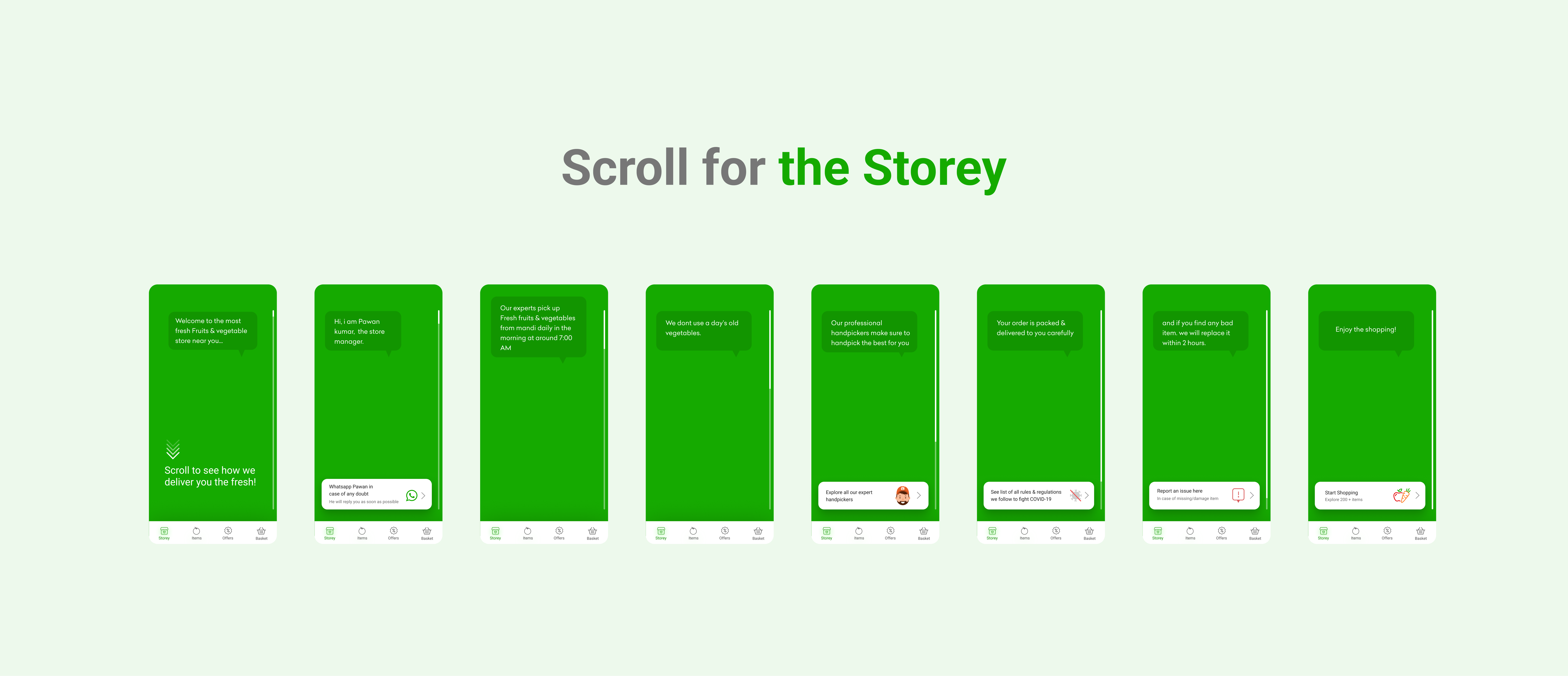
The concept mapped one design answer to each stage of the journey. In consideration, the store introduces itself before selling anything. A scroll-driven story narrated by the store manager explains where produce comes from, who picks it, and what happens if something goes wrong. Trust is built by a person with a name, not a badge. In discovery, browsing feels like walking a mandi. Real photos of the day's stock, uploaded daily, browsed like stories, with list, category, and mandi views to switch between. When prices fluctuate, the app says so plainly, because regulars at a mandi already know prices move. In purchase, we introduced handpickers. A named person picks your order as carefully as you would, which reassures the customer and gives the supply chain side a role worth gamifying.
Validating via experiments
The concept fed a series of live experiments on the real app, measured by our analyst through funnel comparisons against the existing feed.
The biggest bet was an F&V-exclusive feed, a dedicated landing experience built around "We keep it fresh" claims users could verify. Sourced daily from the mandi, no yesterday's stock, delivered in two hours.
The second experiment came straight from the concept's discovery thinking. We put live photos from the store on the feed instead of catalogue imagery, then split the funnel by whether users opened them.
The numbers confirmed the research. Seeing the actual stock answered "is it really fresh?" better than any copy could.
What carried forward
The pod's ideas outlived the project. After Grofers became Blinkit, several of them were adopted into how the company runs the category, including the sourcing time for F&V, the daily-from-mandi rhythm the concept was built around. The lasting lesson for me was that in categories where trust is the product, design work does not stop at the screen. The SOP is the interface.